


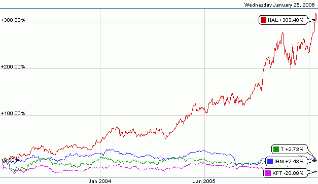
I was looking at smartmoney.com's "Map of the Market" last week, noticed a bright green box that I zoomed in on, and noticed that Halliburton was in it. So I ran a chart of the percentage change in Halliburton's stock price for the last 3 years (red line). It was impressive. For comparison, I looked at representative samples of companies in the technology (IBM, blue line), communication (AT&T, green line), and food (Kraft, pink line) sectors for the same period. Click the graph to see the full-sized image.
Does anyone really wonder why we invaded Iraq?


No comments:
Post a Comment